Design notes, Uniforms
How to Choose Uniform Colours for Your Restaurant (Without Regretting It in Month Three)
Uniform colour is chosen in a bright meeting room and worn in a dim dining room. That single mismatch causes more uniform regret than fabric, fit or price. Here is the framework we use with clients.
1. Check the swatch under your own lights, at night
This is the highest-value ten minutes in the whole process. Warm restaurant lighting shifts everything: cool greys turn muddy brown, crisp whites turn cream, and a considered navy can read black. We send physical swatches for exactly this reason. Lay them on your own tables, after dark, with your own lights on.
2. Let the cuisine set the stain budget
A curry-forward Indian kitchen, a tandoor section or a dessert counter working with chocolate will destroy pale uniforms. A specialty coffee bar will stain everything with milk and espresso. Be honest about what lands on the fabric:
- High-stain service (Indian, Chinese, grills, coffee): charcoal, olive, navy, teak brown, oxblood.
- Moderate (continental, bakery, bar): most mid-tones, with dark aprons.
- Low (fine-dine with plated service, front desk, hostess): whites and pale shades are viable, with spares.
3. Use the brand colour as an accent, not a bath
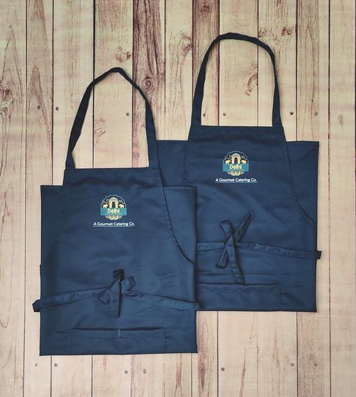
A team of fifteen people in saturated brand red is a lot of red in one room. The uniforms that look best keep the body in a neutral and put the brand colour where the eye lands: collar tipping, apron straps, the inner facing that shows when sleeves roll, the embroidery thread, the piping down a chef coat placket. The result reads as branded without shouting.
If a guest can describe your uniform colour after leaving, you probably went one step too far. If they remember the crest on the apron, you got it right.
4. Colour-code roles, not garments
Keep one cut and one fabric across the floor and change only the shade by team: service in charcoal, housekeeping in olive, bar in ink-blue, kitchen in black or white, manager in service colour plus a waistcoat. Guests learn the system in one visit, and reordering stays simple.
5. Think about what photographs well
Your uniform will appear in guest photographs, food-blogger reels and your own social feed. Deep saturated colours hold up on camera; pale pastels wash out under warm light and mid-greys go flat. Anything with a subtle texture, melange yarns, chambray, washed denim, canvas, photographs better than a flat solid because it holds shadow.
6. Check the fade and the reorder
Reactive-dyed cottons fade over a year of hot washing; a top-up order six months later will not match unless the dye lot is recorded. We keep your fabric code, dye lot reference and thread shades on file so new-hire batches match the original team, which is exactly the kind of detail nobody thinks about until the day a new server stands next to a six-month-old shirt.
Get swatches
Tell us your cuisine, your lighting and your brand palette, and we will send a shortlist of shades in physical swatches rather than screen colours. WhatsApp +91 98213 34906.